Sign In
 Create Account


Deckbuilder Improvements!
Although this doesn't touch on all the requests it is my first shot on moving things forward.
Using some stats for common screen resolution shows that 93% of the users there are at 1280px wide or larger and 55% of people fall between 1280 and 1400. Also 99% of users were on a height of 768 px or larger. I used this as a rough guideline for appropriate sizes of things and so I've adjusted the search and deck sections to be slightly larger than before and the responsiveness to be triggered at different intervals. The results are more usable space.
There is a settings button at the top of the page now which will popup a dialog box where the user can customize some areas of the deckbuilder to their liking.
The Preferences area allows a user to show available identities to select immediately after choosing which side he wants to build for.
The Performance area attempts to speed up the deckbuilder on slower devices. After some testing I found that the graphs cause a majority of the performance issues seen on low end tablets and phones. So on mobile devices auto updating of graphs are turned off by default and a user can choose to either turn them back on in the settings or click a button by the graphs to update them. During my tests on iphone 4s and 1st gen ipad mini (equivalent to ipad 2 hardware) turning off the graph auto update reduced processing time for adding and removing cards from ~1 second to ~150ms, on an ipad air it went from ~300ms to ~90ms, and on a normal desktop from ~100ms to ~5ms. This setting is remembered in a cookie whenever a user changes it.
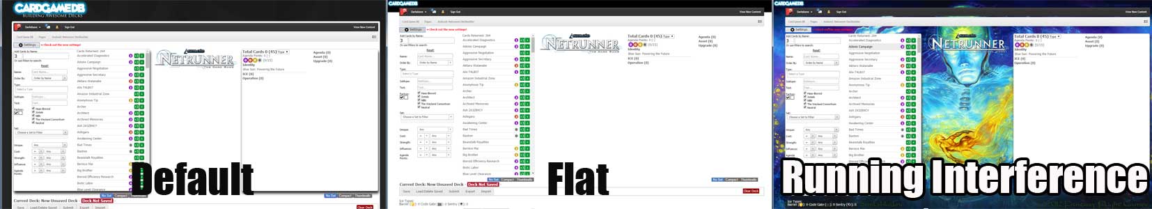
The theme section allows a user to change the look of the deckbuilder. I currently have 3 themes. The first is the default theme. The second is a 'flat' mostly white theme with smaller cardgamedb logo. The third theme uses a game appropriate image as the background for the deckbuilder with smaller cardgamedb logo. This setting is remembered in a cookie whenever a user changes it. Below are examples of the themes.
The Layout section allows the user to switch to their preferred layout. There are 6 layouts to choose from currently (not including default).
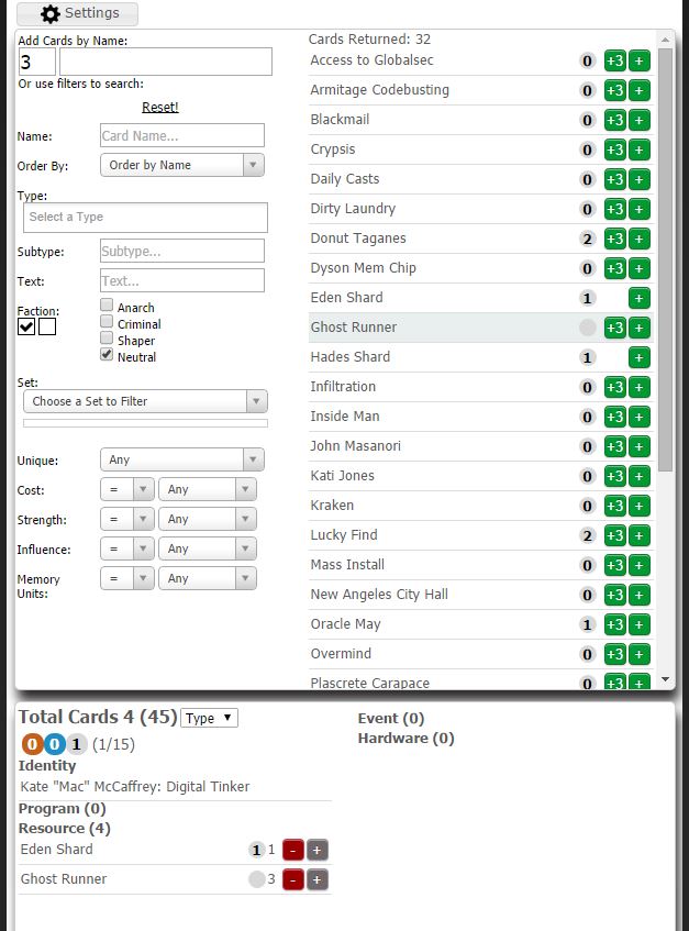
Narrow View - Least amount of space, single column search with a toggle between search criteria and results. Single column deck. Image in center. Best for browsers running 1024x768
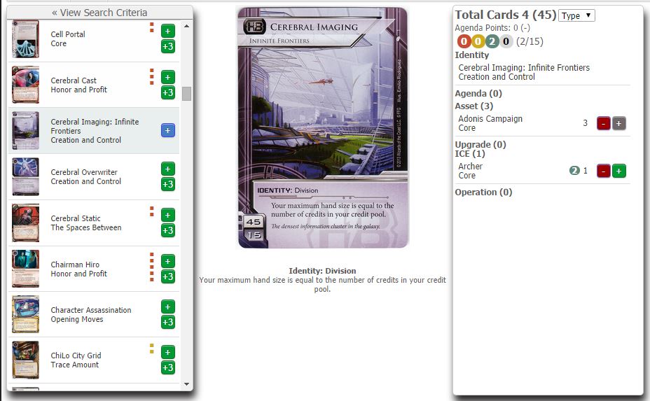
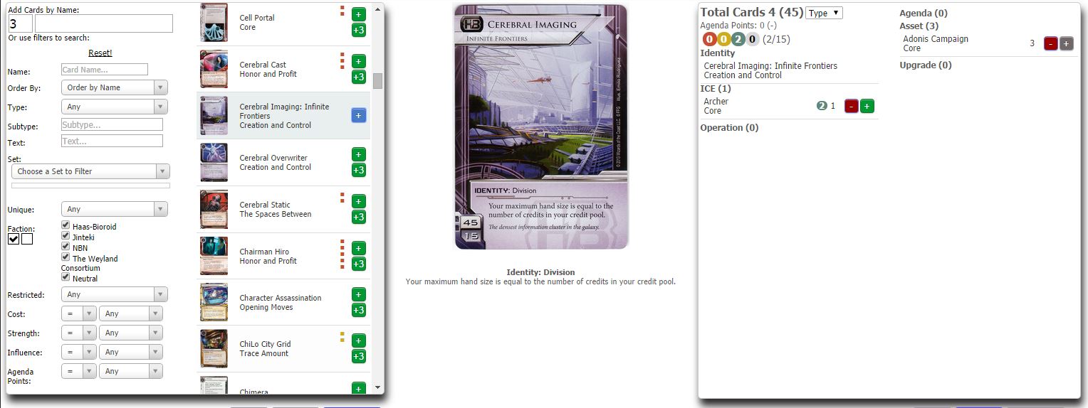
Wide Search - Search criteria and results side by side. Results auto update as search criteria changes. Image in center. Single column deck. Best for browsers between 1280 and 1400 px wide.
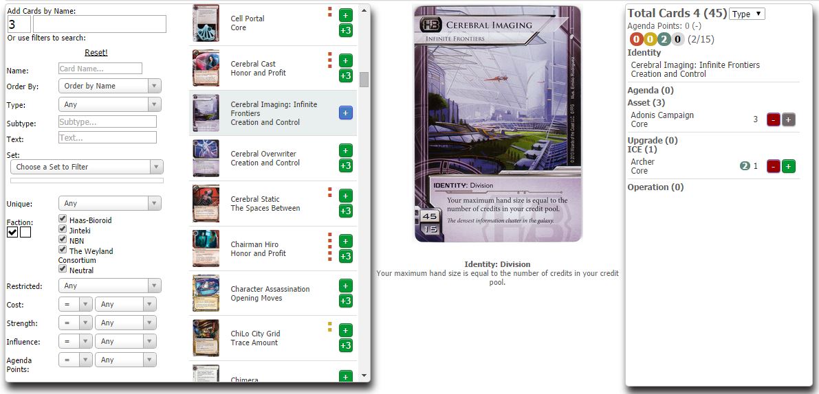
Wide Deck - Single column search with toggle between search criteria and results. Image in center. 2 column deck. Best for browsers between 1280 and 1400 px wide.
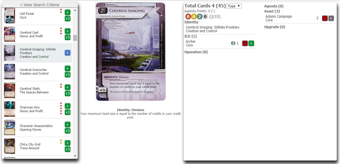
Wide Screen - Search criteria and results side by side. Results auto update as search criteria changes. Image in center. Double column deck. Best for browsers between >1600 px wide.
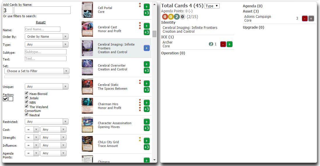
Wide Deck and Search, No Center image - Images show on hover. Search results auto update. Best for browsers between 1280 and 1400 px wide.
Vertical layout - This layout is specifically geared to using on a tablet in portrait position. Usefulness on desktops would be limited I think. The search and deck section are stacked on top of each other. Images shown on click.
At the top of the search criteria area is a numeric and text entry box. Typing in this area will bring up matching card results in an auto complete/typeahead fashion. Choosing one will add that card to the deck in the quantity specified, clear out what you typed and put focus back on the numeric input. Using this you can add cards quickly using only the keyboard.
The card type field will now allow you to select multiple card types to filter by at the same time.
The deck can now be sorted by cost in addition to type
Ice now shows 3 little icons next to them in a deck (shield for Barrier, gate for Code Gate, and eye for Sentry).
Restricted filter field hidden until we actually get a restricted card.
Right clicking a card name in either the deck or search results will open a popup window taking you to the card's record in the database
A "No Set" option has been added to the search results view.
The BBCode and Popup BBCode sections in the bottom menu have been moved under Export.
Under Export you can now choose how you want to export your deck. Options include saving it as a file on your computer or displaying it as Text, BBCode, popup, or (new) Markdown and HTML so you can copy and paste.
The sample hand now shows images and you can draw extra cards. The size of the images can be changed via a slider (size remembered in cookie). Images can be clicked on to fade them out and show the card name cost in a list.
Font sizes have been slightly increased
I have adjusted the images in these to be a new standard size of 420px high.
Again thanks everyone for your feedback and just because something that has been suggested didn't make it in this time doesn't mean that it won't make it next time so please keep on giving your feedback.
 Back to top